Nationwide ThreeSixZero
Redesigning the upfront quote flow for ThreeSixZero's iOS application using design thinking principles, with a focus on enhancing the experience for our target persona, Ashley.
ThreeSixZero aims to provide a seamless and delightful digital experience for bundling insurance quotes. The product focuses on understanding our persona, Ashley, to deliver personalized insurance bundle options tailored to her needs.
Role
UX Designer 🙋🏻♀️
UX Researcher
Product Analyst
Technology Researcher
Digital Product Owner
Product Strategist
Timeline
8 Weeks
Softwares
Figma
Adobe XD
Miro

What is Nationwide ThreeSixZero?
ThreeSixZero is a digital product developed by Nationwide to provide a seamless and enjoyable experience for bundling insurance quotes. Designed with younger audiences like our persona, Ashley, in mind, the product aims to simplify the insurance process by offering personalized bundle options that cater to their unique needs and lifestyles. By focusing on transparency, ease of use, and customization, ThreeSixZero helps make insurance more approachable and relevant for a younger generation of customers.
Who is Ashley?
Ashley represents a modern consumer who expects a digital experience that is intuitive, empowering, and informative — without feeling overwhelming or invasive.

Current problems
We began the project by researching previous iterations of ThreeSixZero. Through demo videos, prototype walkthroughs, and feedback from company employees, we identified recurring patterns in the behaviors and needs of our persona, Ashley.
PROBLEM 01
Users are unclear about when and how discounts are applied during the process.
PROBLEM 02
Users lack flexibility to easily adjust coverage levels in specific areas.
PROBLEM 03
There is a lack of transparency and accessible product information.
Goals
Our primary goal was to guide Ashley through the insurance quote process with greater transparency while providing more control over bundling and personalizing her insurance quote.
❓
So how might we enhance the digital insurance quoting process?
Understanding the product
To better understand how Ashley felt about our product, we began by listening to her needs and frustrations. We participated in cognitive walkthroughs, usability testing sessions, and conducted our own small-scale research with participants like Ashley to gain deeper insights into their experiences with insurance shopping.
KEY INSIGHT 01
“I appreciate convenience but not to the point of creepiness”
KEY INSIGHT 02
“I am price sensitive! I would like to see how every piece of information I provide connects to my final quote.”
KEY INSIGHT 03
“I value transparency, but also value a fast, frictionless, and tailored experience!”
Exploring user values
As part of our intern team’s research, we conducted a card sorting exercise to gain deeper insights into Ashley's values and preferences. We developed the exercises and interviewed participants similar to Ashley, focusing on seven key objectives to better understand her priorities and perceptions of the proposed quote flow.
To make the research more engaging and insightful, we incorporated situational and behavioral questions like, ‘If your house was on fire, what are the three objects you would save?’ This approach helped uncover what Ashley values most in her household and provided valuable context for designing a more personalized user experience.
CARD SORT 01
Understanding what Ashley values most in her household

CARD SORT 02
Understanding what Ashley is willing to spend on VS where she chooses to save.

CARD SORT 03
Understanding Ashley’s vision for her future milestones.

CARD SORT 04
Learning when and where Ashley feels secure sharing her information.

CARD SORT 05
Identifying what Ashley perceives as related to insurance and what feels unrelated.

CARD SORT 06
Understanding Ashley’s top insurance priorities.

CARD SORT 07
Understanding how Ashley would structure the question flow.

Our research revealed three key insights:
KEY INSIGHT 01
Transparency and Pricing Sensitivity – Ashley values full transparency in product offerings. Like most insurance buyers, her decisions are highly influenced by pricing and a clear understanding of cost breakdowns.
KEY INSIGHT 02
Flexibility with Boundaries – While Ashley appreciates flexibility and convenience, she is wary of experiences that feel intrusive or overly personalized to the point of discomfort.
KEY INSIGHT 03
Need for Guidance – Shopping for insurance can be overwhelming, and Ashley values clear guidance to help her navigate the process with confidence.
Potential solutions
Based on the insights gathered, we brainstormed 12 potential solutions and narrowed them down to three key concepts. These solutions aim to enhance user control, transparency, and ease of use, addressing key pain points identified in our research.
SOLUTION 01
Live Price Update – A dynamic price update feature that adjusts the quote in real-time as users progress through each question, providing immediate feedback on how their selections impact the price.
SOLUTION 02
Slider UI Component – A flexible slider to allow users to fine-tune their coverage options, giving them the convenience of customizing their choices to better meet their needs.
SOLUTION 03
Nora, the Virtual Assistant – Integrating Nationwide’s virtual assistant, Nora, to offer step-by-step guidance throughout the quote process, ensuring users feel supported and informed at every stage.
SOLUTION 01
Price updater
As the lead UX designer on the project, I began by iterating on several options for notifying users when a discount is applied. After iterating on several options, we conducted a small usability test with cross-functional team members to gather feedback and determine which solution best aligned with Ashley’s needs and preferences.

In my exploration sketches, I focused on how best to notify users about discounts, experimenting with various approaches, including whether to display the discount percentage within the notification message below the header.

I also explored the optimal placement for the package price updater, testing options both below the header and above the footer to see where it would be most intuitive for users.

I explored how to integrate the price update and discount notifications. One approach placed both below the header, with the discount notification as a temporary page-level message to minimize screen clutter. Alternatively, I considered consolidating both the pricing and discount information in a single section below the header for a more streamlined experience.
SOLUTION 01 – FINAL DESIGN
We discovered that:
💡 Users found the price update below the header more noticeable.
💡 Displaying both the package price and discount updates together felt too information-heavy.
💡 Users were more comfortable with page-level messaging that appears briefly.
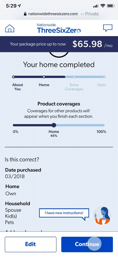
Based on this, I kept the live price update below the header throughout the flow. When a discount is applied, a short page-level message will notify users.
The bundle price, shown in the navy bar at the top, updates based on responses. This approach ensures transparency, helps users track pricing in real-time, and reduces surprises at the end.


SOLUTION 02
Slider UI
During product usability testing, participants expressed a desire for more flexibility in answering questions, rather than being limited to predefined options.
For example, many participants wanted the freedom to select multiple categories when answering questions about their home finishes, as they felt their homes could fall into more than one category (Standard, Upgraded, High End).

First, I explored an option allowing users to select either a predefined category (Standard) or a dollar range for each home finish. This would enable users to specify the exact amount they've spent on finishes like roof or flooring, providing more accurate personalization.

During usability testing, participants often identified with more than one home finishes category.
To address this, I explored a second option that offered users the flexibility to select multiple categories, allowing for more accurate representation of their home finishes.

Many participants were curious about how each home finishes category translated into a dollar amount.
This led me to explore an option where users could specify the total cost of their home finishes, providing a clearer understanding of the pricing.
SOLUTION 02 – FINAL DESIGN
We discovered that:
Users preferred categorizing themselves between two home finish categories. Based on this, we decided to offer flexibility through a slider for a more personalized experience.
However, when we presented the flexible slider concept to our stakeholders, we received important feedback from the policy center. They pointed out that if users input a specific dollar amount for questions like household-valued items, it could still adjust their selection on the back-end, which could confuse users.
As a result, we decided to limit the flexible slider to questions where users can select between categories, ensuring transparency and preventing any unexpected adjustments.


SOLUTION 03 – FINAL DESIGN
Quick quote VS Guidance
We noticed that shopping for insurance can be overwhelming, especially for first-time buyers. To address this, we gave users the option to either get a quick quote for browsing pricing or go through the full quote process with guidance from our virtual assistant, Nora.
If users choose the guided flow, they can enable auto-fill technology to automatically populate public information, such as their address, saving time. They also have the flexibility to turn Nora on or off at any point. Nora provides helpful tips and guidance, particularly for users who are new to buying insurance.


SOLUTION 04 – FINAL DESIGN
Improving user support interaction
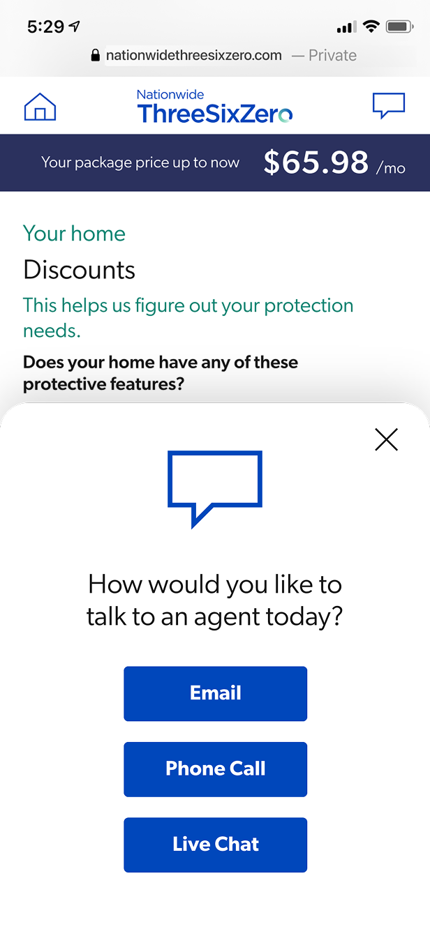
Pre-iterations of ThreeSixZero included a chatbot for user assistance. However, through research, we found that many users felt non-live chatbots were not as effective, preferring to talk to a real agent when they needed help.
To address this, we designed a service option where users can choose how they want to interact with agents—via email, phone call, or live chat. This gives users flexibility and ensures they receive guidance as quickly as possible.
For users who prefer to reach out by phone, instead of calling Nationwide directly, they can input their phone number and receive an estimated callback time. This saves users time and eliminates the frustration of waiting in long phone queues.


Conclusion
HOW COULD IT MAKE AN IMPACT?
We believe that launching this product can significantly increase Nationwide’s reach to younger demographics, which will be a key measure of success. Targeting younger audiences is crucial for Nationwide, as most of its products have historically catered to older demographics.
By aiming at a younger audience with ThreeSixZero, Nationwide can expand its target audience and enhance the insurance-buying experience across a broader range of demographics.
HOW WOULD WE MEASURE SUCCESS?
The measure of success for ThreeSixZero is the increase in bind rates, which reflects the effectiveness of the user experience. By improving usability, transparency, and satisfaction throughout the quote process, we aim to drive higher conversions and ensure users are more likely to complete their insurance journey.
WHAT COULD WE HAVE DONE DIFFERENTLY?
Broader User Testing Across Demographics – While focusing on Ashley as a representative persona for the younger demographic was essential, conducting user testing with a wider range of age groups could have provided more insight into the experiences and needs of different customer segments. This might have helped further refine the product’s appeal to a diverse audience.
Personalization Features – Adding more dynamic, data-driven personalization could have enhanced user engagement.
Accessibility – Prioritizing accessibility features from the start would have made the product more inclusive.
THANK YOU 💙